
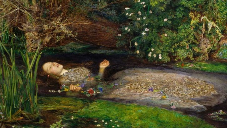
Old classic paintings and frescoes were painted with incredibly rich colors.
Many of those shades went on to become iconic in art communities around the world, but did you know that many of them are no longer produced?
Here’s the story of 10 beautiful colors that don’t exist anymore.
1. Bremen Blue
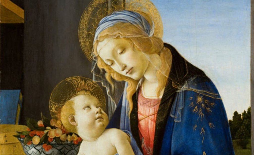
Bremen Blue first showed up in 18th-century Germany. It had this soft, blueish green glow that painters found to be magical.
The only problem was that the color couldn’t last. The pigment faded quickly as the shade simply wasn’t built to last like other shades of blue were.
Artists loved the look at first, but they quickly realized that it faded from paintings before their very eyes!
Pretty soon, the Bremen Blue was avoided. Eventually, more lasting and endurable shades of blue came to replace the shade, pushing it completely out of use.
Art is meant to outlive its creators and civilization, so what’s the use of a color that couldn’t even stay consistent?
Today, it survives in a handful of old, faded artworks. That’s how we know it existed at some point, but it also proves why it didn’t stay around.
2. Realgar
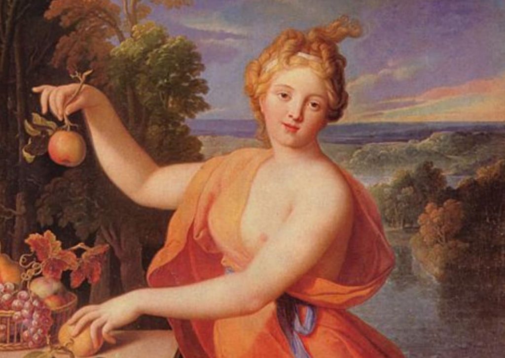
Realgar was a bold and fiery orange-red color that painters used to create a contrast to orpiment (metallic gold shade).
It came with arsenic, which should have been enough of a red flag.
But aside from toxicity, like many arsenic-based colors, Realgar couldn’t handle exposure to sunlight. It looked incredible when freshly painted, but sunlight completely changed it.
It didn’t only fade; it actually turned into a dull yellow powder!
This change didn’t happen right away; it could take up to ten years, but in the world of art, that’s still too soon.
The shade wasn’t reliable or safe enough, so it simply faded out of use.
3. Aureolin
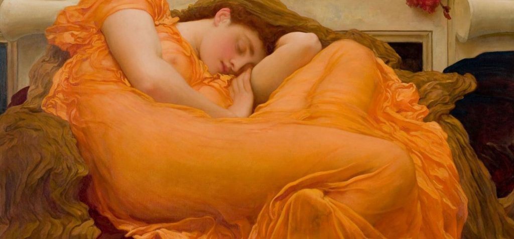
Aureolin used to be a favorite among watercolor painters because of its transparent and almost glowing yellow tone!
It was perfect for delicate details and light washes.
The original version of this pigment was cobalt-based, which gave it that beautiful glow. However, cobalt-based Aureolin also didn’t fare so well in 日光.
The shade would change and turn much more dull and dark.
Eventually, paint makers moved on and started using substitutes that could create this glow without fading.
So while you can still buy paint labeled Aureolin, it’s not really that exact same pigment that artists fell in love with.
The original formula was dropped.
4. Lead White
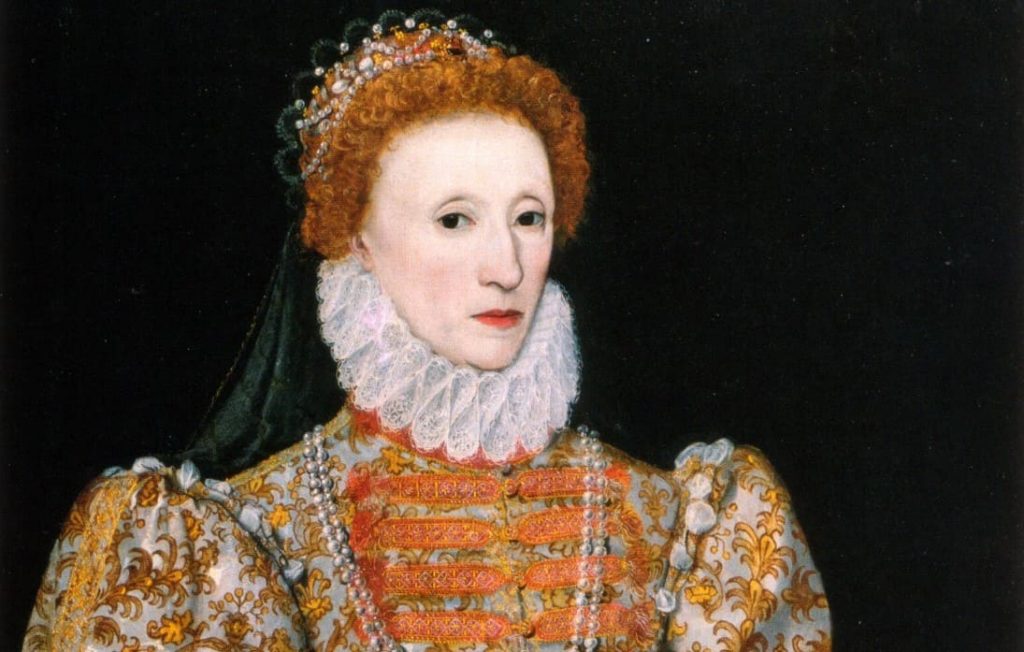
For more than two thousand years, Lead White dominated Western paintings.
It allowed artists to create that luminous white glow you see on faces, fabrics, and highlights across countless iconic pieces.
For instance, Johannes Vermeer relied heavily on this color while painting his Girl with a Pearl Earring.
Nothing came close to its brightness, so painters used it constantly. But… it was literally made with lead!
Grinding it, mixing it, and working with it day after day caused major health problems, from nerve damage to something even worse.
In the past, people didn’t really understand the danger, so for generations, it remained one of the most popular pigments in all of art!
Once the health risks became impossible to ignore, titanium and zinc white eventually came to replace it.
They can’t quite replicate its iconic texture, but something has to give.
5. Orpiment
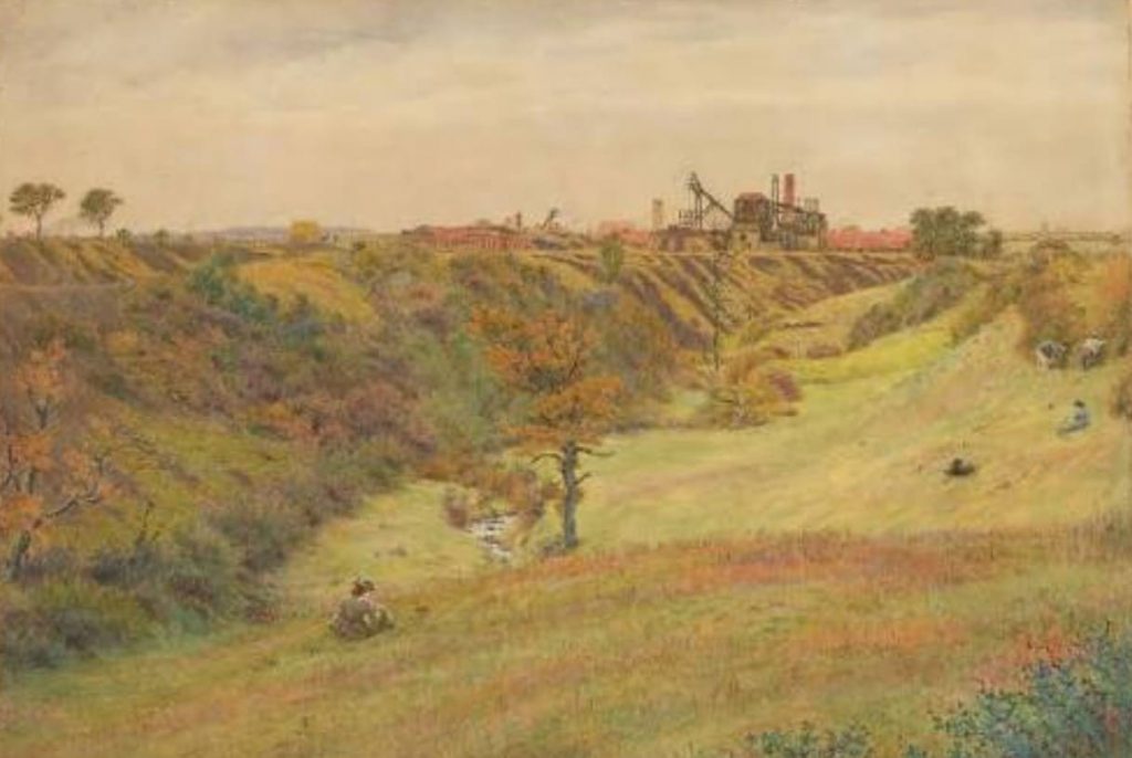
Orpiment was a metallic golden-yellow that was a favorite among many different civilizations.
Ancient Egyptians used it, and Persian artists also. It actually stuck around all the way into the Renaissance!
But the color was also made from arsenic sulfide, meaning that it was literally poisonous.
Artists were painting with a pigment that was slowly killing them, often mixing it by hand without any protection.
On top of this, Orpiment wasn’t even chemically stable! It could react negatively to other pigments, especially those containing lead.
The painting could be completely ruined if the two pigments came into contact!
At some point, it became clear that the color wasn’t only a risk to a painter’s health but also to their art!
More stable yellows eventually came to replace it. We can now only see it in old paintings, monuments, and manuscripts.
6. Paris Green
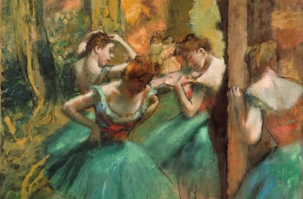
Paris Green first came out in 1814, providing a vivid, emerald green tone that people couldn’t get enough of!
And it wasn’t just used in paintings, but it ended up everywhere! Wallpapers, fabrics, and home decor were Paris Green because the demand for the color was that high!
But its main ingredient was arsenic. Again.
Homes decorated with Paris Green wallpaper, especially in damp rooms, could actually release dangerous fumes over time!
People got sick without knowing why, and no one suspected the wallpaper or the tablecloth to be the culprit!
As the health risks became undeniable, governments had to get involved and ban the production of Paris Green.
7. Mummy Brown
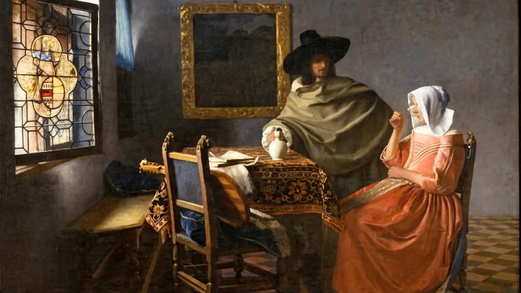
This color was exactly what it sounds like: its rich brown pigment was made by grinding up ancient Egyptian mummies mixed with resin and myrrh.
As horrific as that was, the pigment was genuinely popular among 18th and 19th-century artists. Its deep and warm shade was mainly used for shading and shadows.
For a while, people were happily ignorant about its origin, but then the ethical problems became impossible to ignore.
The pigment literally required desecration of an ancient corpse, which should have been off-putting from the very beginning.
On the more practical side, mummies weren’t exactly a renewable source, so the production would have to stop at some point, anyway.
These days it stands as one of art history’s strangest cautionary tales: don’t sell your humanity for a nice color!
8. Scheele’s Green
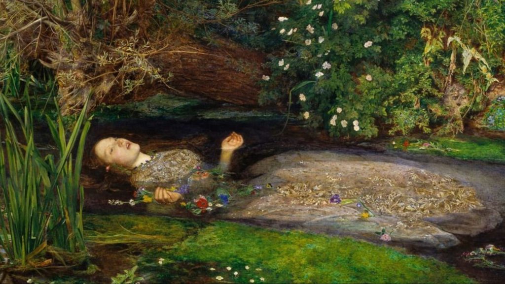
Scheele’s Green was one of the first bright green pigments ever invented, and Victorian society absolutely fell in love with it!
It showed up in art, walls, fabrics, and decor.
Can you guess what it was made from?
Bingo. The color slowly released arsenic over time, especially in humid conditions.
People surrounded themselves with Scheele’s Green, unaware that their fresh, beautiful decor was slowly making them sick.
Mysterious illnesses started appearing, but it was a while before anyone could connect the dots and blame the pigment.
Its popularity collapsed fast as the number of 健康問題 そして deaths it had caused became public!
9. Indian Yellow
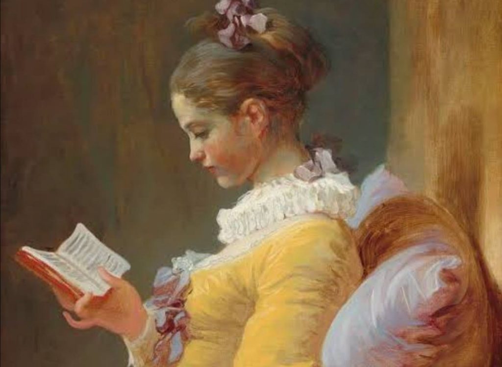
Indian Yellow had this warm, golden glow that European painters adored, but its origin story is really weird.
Legend has it that the pigment was originally made from the urine of cows that were fed nothing but mango leaves!
Apparently, this diet produced the unusually vivid yellow pigment.
We still don’t know if this claim was accurate or not, but it raised ethical questions about animal treatment, either way.
Feeding cows a restricted diet just for the sake of pigment was recognized as unnecessary and cruel.
The production of the original pigment eventually stopped altogether.
You can still buy paint labeled Indian Yellow, which is produced with different, vegan methods.
10. Tyrian Purple

Tyrian Purple is a legendary pigment, extracted from thousands of tiny sea snails!
The process of making it was extremely difficult and complicated, so the price of the paint reflected that tenfold!
This luxury shade of purple was so pricey that only royalty and other extremely wealthy people could afford to wear it in the ancient world!
It quickly became associated with power and status because of this inclusivity.
Producing even a small amount required harvesting an enormous number of snails, which made large-scale production impractical.
Over the centuries, the exact method of creating this color was lost, so it’s not commercially made anymore.
In our time, there have been attempts to sustainably collect murex snails so that this incredible pigment can be produced once more.

A little Aquarius, devoted to writing and embroidery. Through my writing, I hope to empower readers to align with their true selves and navigate life’s mysteries with confidence.